Cross River, Employer Brand
The Cross River Employer Brand was thoughtfully built from the ground up to provide a stronger, more fitting, and engaging identity tailored specifically for Cross River new R&D fintech sister company.
Re-Branding
The mission was to reimagine and adapt the bank's branding to align with the dynamic identity of the new R&D fintech, start-up-like company. The primary goal was to attract and recruit a younger demographic while positioning the company as youthful, tech-driven, and infused with an innovative start-up spirit.


Colors
The muted color palette was updated to feature more saturated and vibrant tones, while the previous color scheme was streamlined and consolidated to create a stronger, more recognizable Employer Brand.

Logo
The logo was updated to be monochromatic, emphasizing and empowering the Employer Brand's leading color for a bold and cohesive visual identity.

Typography
The classic serif font and its complementary free font were replaced with a modern sans-serif typeface for all applications. Weight and color now serve as the primary tools for establishing typographic hierarchy, ensuring clarity and a contemporary visual style.


Mascot
To further enhance the Employer Brand's approachability and uniqueness, the decision was made to create a mascot. This character will serve as a friendly and memorable representation of the brand, helping to build stronger connections with our audience.
The mascot was designed as an astronaut, symbolizing a spirit of exploration, innovation, and a forward-looking approach. The design emphasizes approachability and playfulness, featuring a ‘chubby’ and friendly appearance. Rendered in flat colors, the mascot seamlessly aligns with the overall color palette and visual identity of the Employer Brand.


The designs surrounding Employer Branding elements will create an immersive world for the mascot to interact with and be a part of. This world will align with the content it promotes, showcasing the mascot’s personality while reflecting the company’s values and spirit in a dynamic and engaging way.


To boost engagement on social media, the mascot's designs have been enhanced with animations. These animations are designed to run in loops, capturing attention and increasing visual appeal across social media feeds.


A collection of animated WhatsApp stickers was created for HR communication, featuring the mascot in a variety of on-brand, engaging designs. These stickers add a playful and approachable touch to interactions, enhancing the candidate experience while maintaining brand consistency.

Internal
For internal design, the branding was strategically adapted to meet different needs. In-office designs retain the brand’s colors and typography but adopt a cleaner aesthetic to maintain a more professional feel. Meanwhile, digital and communication materials preserve the playful spirit and typography while incorporating 3D elements and a more open, dynamic approach to colors.


Off Brand
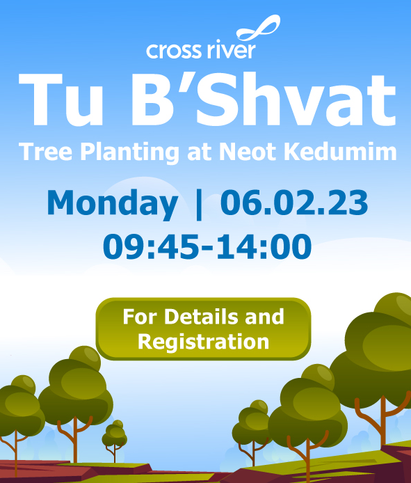
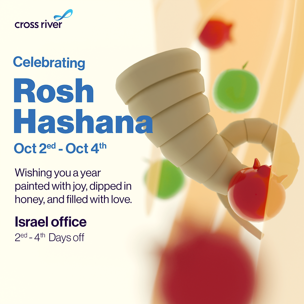
Certain special events for company employees received a unique, off-brand design treatment. Each event’s visuals were tailored to match its specific theme, creating a distinct and memorable look.